Source: Enerhodar City Council
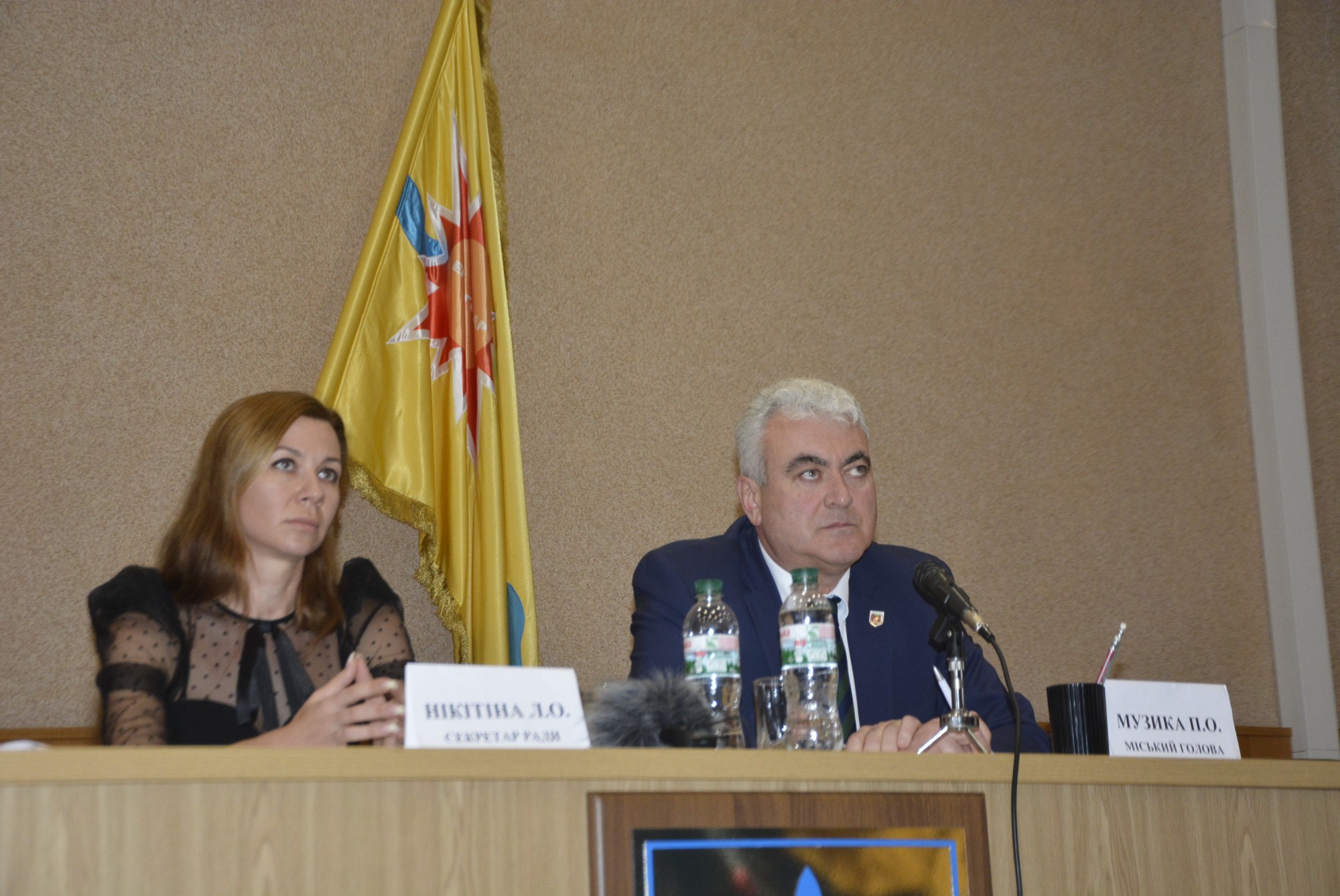
Energodar city council approved the city’s brand.
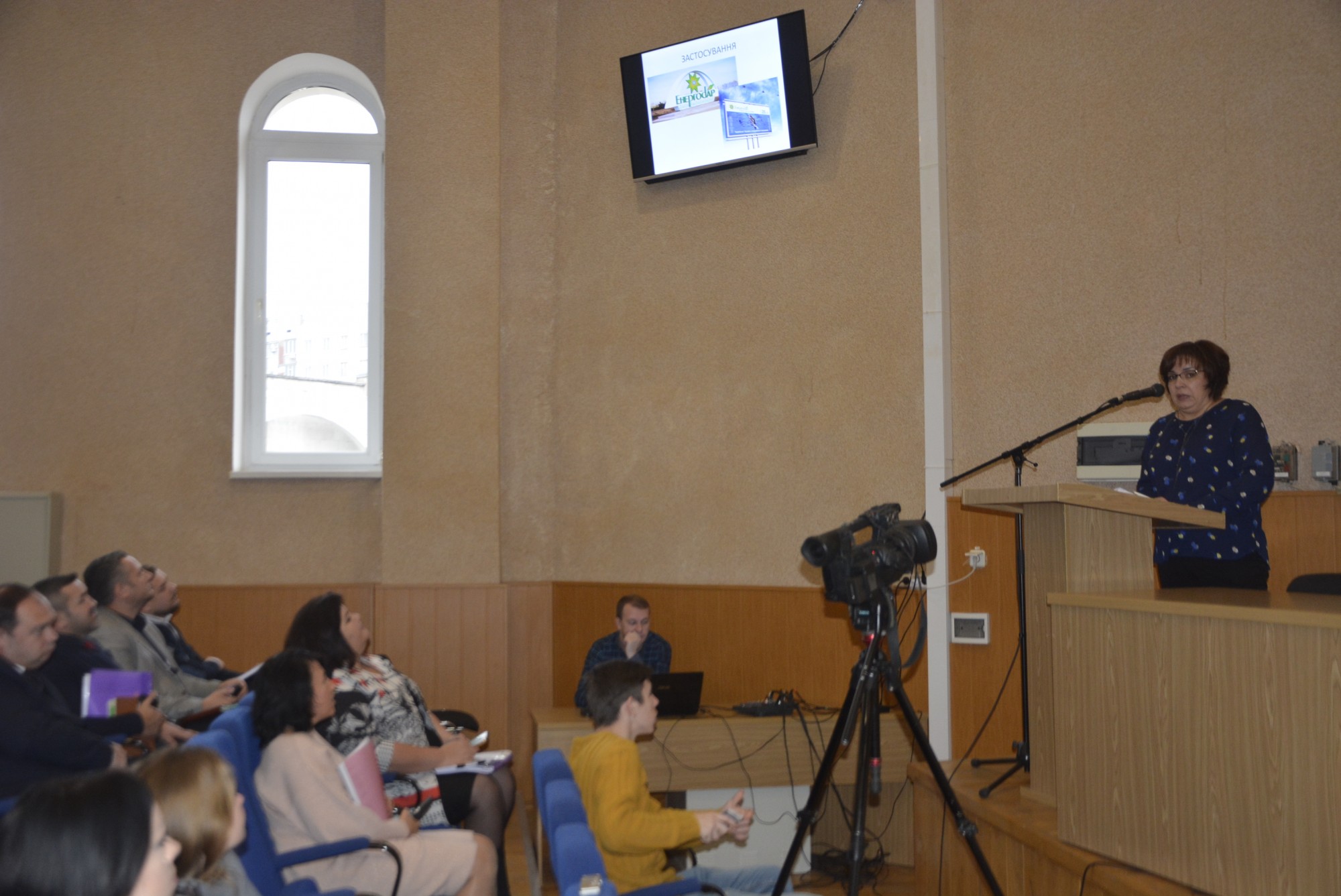
Since 2017, the project “Creating a Positive Image of Enerhodar as an Investment Attractive City” has been implemented with financial support from PLEDDG Project. In the framework of PLEDDG, the Enerhodar Marketing Strategy until 2025 was developed, as well as the city’s brand.
The work on the development of the strategy has taken the city the whole year. A survey across various population categories was conducted: employees of backbone enterprises, budget institutions, pensioners, and schoolers of the city took part in the survey. The analysis of the survey showed that, in general, citizens preferred the word “energy”. Among colorful illustrations, Enerhodar residents gave a green color the number one position.
The logo and slogan of Enerhodar were developed by the design group selected on a competitive basis. The figure shaped by atom orbit which may be seen in the photos under the microscope became the underpinning one in the city’s logo. Besides, this figure echoes the ethnical symbol derived from Ukrainian vyshyvanka: stella octangula in Ukrainian embroidered shirt is an image of the Sun and is a symbol of power and energy. The logo fully complies with the brand’s key idea accented with “Giving Energy” slogan.
Energodar city brand will help shape a positive image of the city, create a favorable business climate for external investors and local businesses, and promote competitiveness of local enterprises.